Table of Contents
- Project Overview
- The Brand Story
- Brand Identity
- App Mockups & UI/UX
- Photography & Illustration
- Download Brand Guidelines
Project Overview: Pawfect Match
This project involved creating a complete visual system including:
- Brand Identity (logo, colors, typography)
- App UI/UX Design (mockups, user flows)
- Visual Assets (illustrations, photography style)
- Brand guidelines for consistent application
The design solutions focused on:
- Creating an approachable yet professional identity
- Developing intuitive user experiences for complex matching systems
- Establishing visual cohesion across all touchpoints
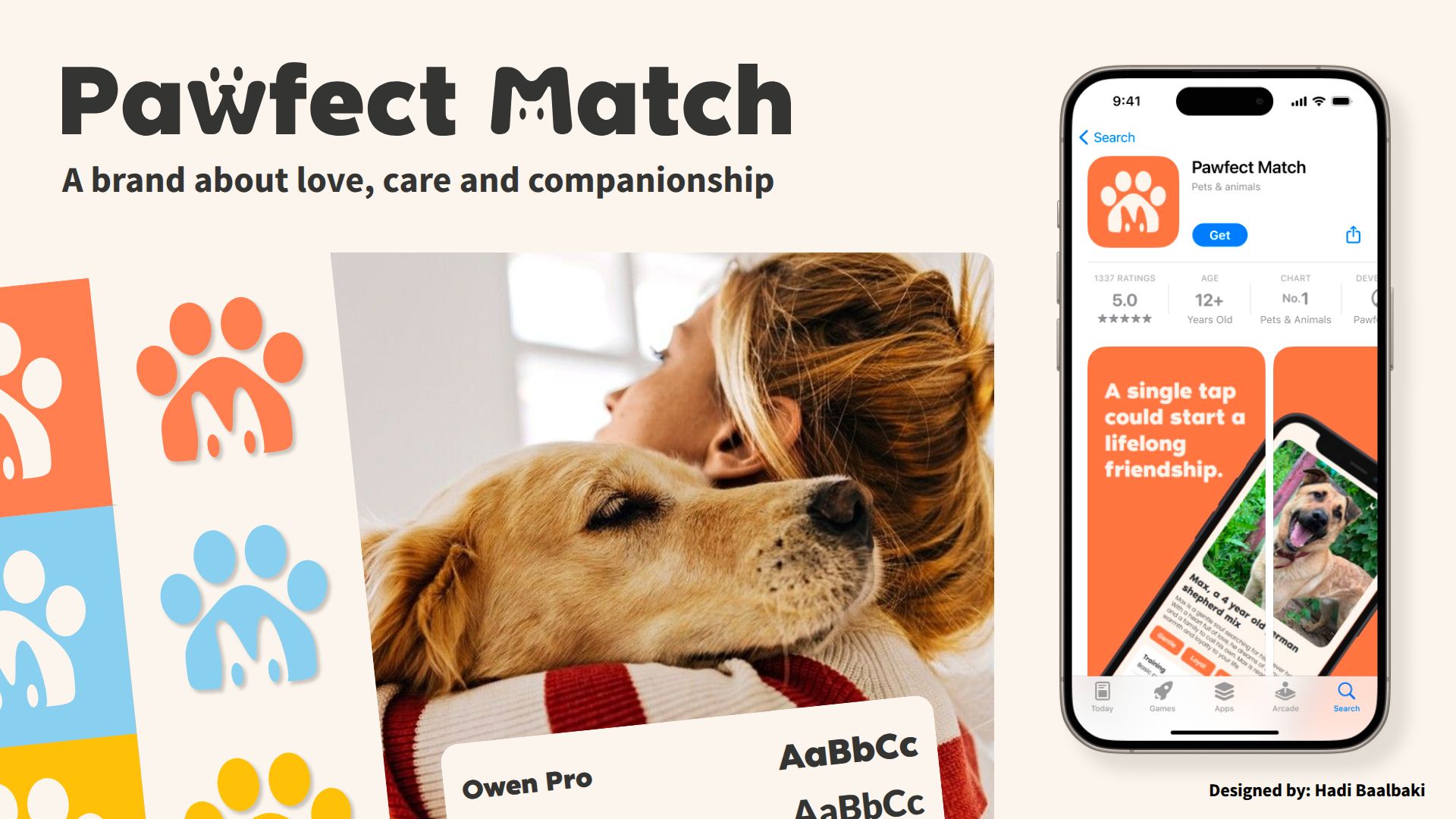
The Brand Story
Pawfect Match is an online platform designed to streamline the pet adoption process by connecting adopters with shelter pets in need of loving homes. Our matching system pairs individuals with their ideal four-legged companion based on lifestyle, personality, and compatibility. simplifying the journey from search to adoption.
We empower shelters and rescues to create detailed pet profiles, increasing visibility and adoption success rates. For adopters, we provide a seamless, intuitive experience to discover, connect, and meet pets ready for their forever homes.
Brand Identity
Logo Design
Concept: A warm, memorable logo that visually represents the brand’s mission of connecting pets with loving homes through smart matching.
Key Elements:
- Paw Shape: Directly ties to “Paw” in the name and pet focus
- House Outline: Symbolizes shelter and forever homes
- Hidden “M”: Negative space forms letter for “Match”
- Cat Silhouette: Represents all pets and companionship
- Curved/Flat Design: Friendly (rounded top) + stable (flat base)
Color Palette
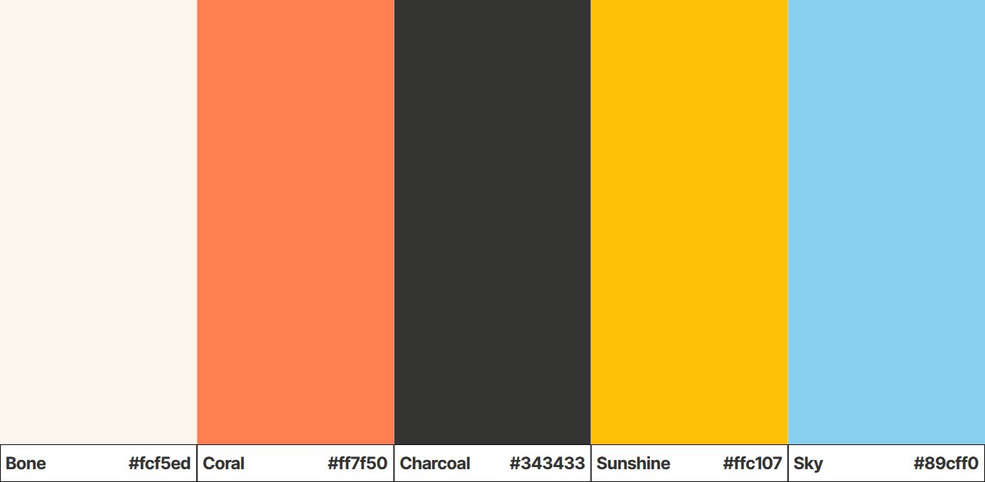
Brand Emotions: Warmth, optimism, and trust - capturing the adoption journey
Color System:
| Color | Hex Code | Purpose |
|---|---|---|
| Bone | #fcf5ed | Neutral background - creates warmth and balance |
| Coral | #ff7f50 | Energy and compassion - highlights adoption calls and storytelling |
| Charcoal | #343433 | Stability and professionalism - ensures readability and authority |
| Sunshine | #ffc107 | Joy and optimism - reflects happiness pets bring to people’s lives |
| Sky | #89cff0 | Trust and reliability - builds confidence in the platform |
Design Approach:
- Thoughtfully selected to evoke adoption emotions
- Balances vibrancy with professionalism
- Ensures accessibility and visual harmony
- Maintains brand consistency across all applications
Typography
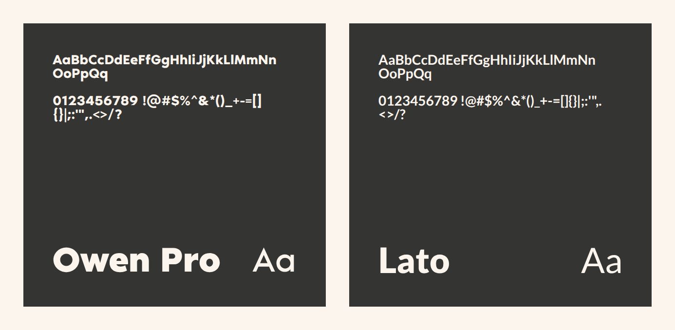
The typography reflects the brand’s dual nature: professional yet warm, modern yet approachable.
-
Owen Pro (Primary) Usage: Titles, headers, brand statements Style: Bold, modern, rounded Purpose: Creates impact, establishes brand recognition, conveys approachability
-
Lato (Supporting) Usage: Body text, captions, long-form content Style: Clean, legible, subtly warm Purpose: Ensures readability, complements Owen Pro without competition
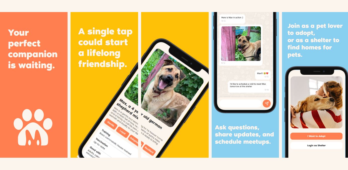
App Mockups & UI/UX
Photography & Illustration
(Your content here)
Download the Brand Guidelines
Here you can find the full brand guide book designed and delivered to the client. Download PDF document
Get in Touch
Let’s build something great together. get in touch
Written by: Hadi Baalbaki --- Published on: 2025-09-10